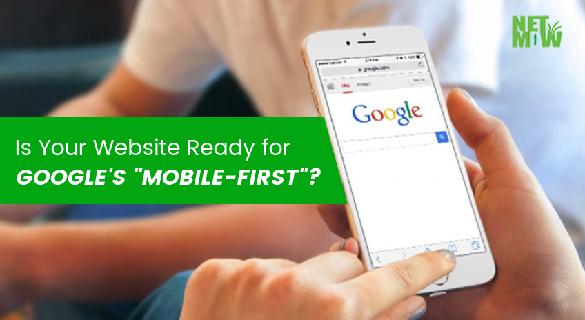
Google is always changing and updating its algorithms in a bid to deliver the best and most relevant results for searches on its platform. John Mueller said google mobile first index will exclude all desktop content. With so many people conducting searches via a mobile device these days, Google is on the verge of introducing its Mobile-First algorithm.
But what is Mobile-First and are you ready for it?
Google’s Mobile-First Index Explained
Mobile-First is a new search index Google will likely be introducing and rolling out sometime in 2018. According to a variety of recent studies, some 60% of the global population now access the internet from a mobile device rather than a desktop or laptop computer.
Until now search algorithms have basically targeted websites designed to be viewed on a desktop environment. Because so many people are now using mobile devices with much smaller screens, and often viewed in portrait mode rather than landscape, Google has seen the need to favor websites in their search results that are “mobile-friendly”.
Google wants to deliver results that give mobile users the best user experience possible. Therefore websites that are designed for mobile, or are responsive in nature, will have a preference in Google searches once Mobile-First is introduced.
How To Prepare for the Mobile-First Roll Out
The very first thing to consider is whether your website is in fact mobile-friendly. If it’s not, then it should be regardless of whether Google wants to introduce the Mobile-First algorithms or not. With so many people accessing the internet on smaller mobile devices, if your site doesn’t display the text and images properly, people will simply leave and go elsewhere.
A website needs a “responsive” design. Basically, this just means that the design of the website’s layout is flexible and not rigid, so when someone views your content on a mobile device, they will still be presented with the exact same content they would see if viewing the page on a computer. The layout will change due to the size and orientation of the screen, but all content will be visible.
Websites that lose portions of their content when viewed on mobile devices will be penalised under Google’s new Mobile-First index.
Even if you have a responsive design, you still want to make certain all your content and navigation look good on all devices – from desktop, to tablet, to a smartphone. You might find that heading sizes, menus, and so forth get scrambled when viewed on a smaller screen and adjustments will need to be made to correct these idiosyncrasies for a better user experience.
Another point to consider is not to use a “Read More” button to hide longer content. This hidden content will be completely ignored by Google once the Mobile-First index is rolled out.
If you have any text or content hidden behind a button or menu tab, then reveal it so all content is visible. Failure to do so could lead to a drop in rankings, or not being ranked at all when the new index is introduced.
These days all websites should be mobile-friendly anyway, so now’s the time to make sure yours is.
Read More: SEO Practices That Can Kill Your Rankings
https://netmow.com/best-local-seo-services-in-gold-coast-australia/
Related Article

Best SEO Gold Coast Company: Enhancing Your Online Presence

Local SEO Gold Coast – Attract More Local Customers

Common SEO Mistakes to Avoid in Gold Coast


